Brookwell
At a glance
- Role
- Contract product designer
- Team
- 2 founders
- 5 engineers
- 3 designers, including me
- Timeline
- Aug to Nov 2025
- Platforms
- iOS and Android
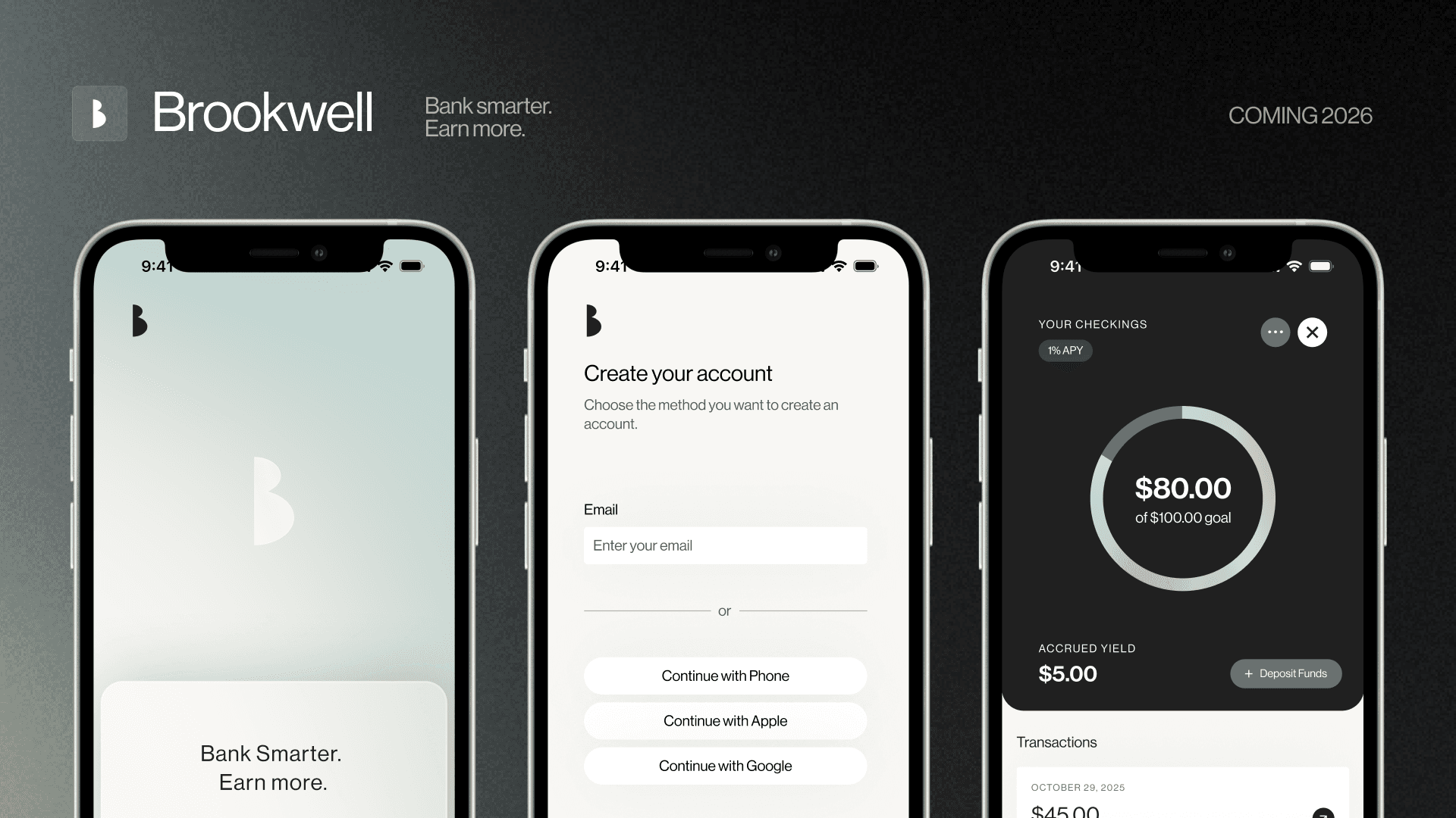
I led product design end to end for Brookwell, a bank account that earns up to 10% while keeping the crypto behind it completely out of sight.
In three months I went from workshops with the founding team to six core flows, from sign-up to card management, then built the design system and dev-ready specs for its 2026 launch. The waitlist is now live.
Context
What if your bank account actually earned something?
Brookwell pairs an FDIC-insured checking account earning 1% with a stablecoin-powered savings account earning 10%, all in one mobile app.
The constraint: it’s a regulated bank account, so identity checks (KYC) and an SSN are required by law. I couldn’t remove them, only choose when and how to ask.
Problem
Two worlds in one account
Before designing, I ran sessions with the founding team on how money flows, where the risk is, and what users need before they’ll trust it. Merging regulated banking with DeFi surfaced three problems.
10% sounds too good to be true
After FTX and Celsius, a high rate reads as a catch, and words like “DeFi” and “on-chain” only confirm it.
Asking for an SSN too early
Asking for an SSN and ID before someone feels committed is a major drop-off risk.
Yield you can’t see
Passive earnings are easy to forget. If people can’t see their money grow, they never feel the product’s value.
Root cause
Trust breaks when people have to understand the machinery behind their money.
Persona
Meet Alice
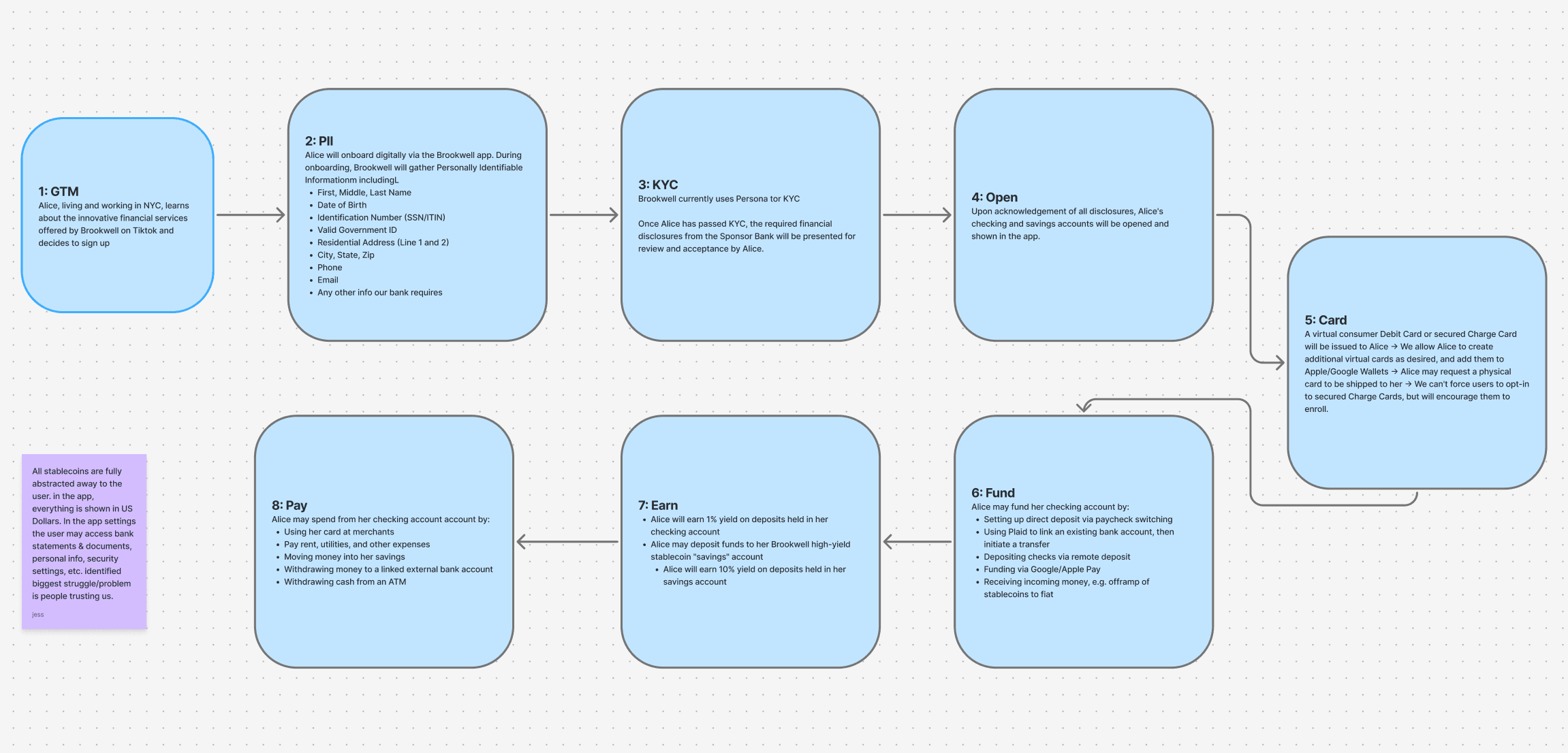
Alice came out of our user research. She’s 24, works in tech in NYC, and found Brookwell on TikTok. She stands in for our audience: Gen Z, 18 to 30, financially curious but skeptical.
Wants her money to work
Drawn to passive income and crypto’s upside, not its mechanics.
Has watched people get burned
Friends lost money in crypto, so a high rate makes her look for the catch.
Trusts TikTok, then checks the fine print
Finds products through creators, but reads reviews before handing over anything personal.
The tension
She wants her money to earn more, but one hint of a catch and she’s gone.
Approach
Yield should feel like a feature, not a mechanism
In our competitive analysis, Robinhood stood out: it made investing approachable by cutting the jargon and friction. We set out to do the same for yield.
How might we
Make 10% feel as safe and ordinary as a savings account?
Two principles we checked every flow against
Show the outcome, hide the mechanism
People should always see what their money is doing, never have to learn how.
Earn trust before asking for it
Ask for the least first, and never ask without a reason.
From lo-fi to hi-fi
Solution
Three decisions that carry the product
Speak bank, not blockchain
Words like “DeFi” and “on-chain” sound like volatility, not savings. So balances are in USD and savings is simply a high-yield savings account. Crypto-savvy users can still fund with stablecoins; everyone else never has to think about them.
Start light, and say why you’re asking
Sign-up starts with just an email, and the SSN and ID come later. Every step says why it’s needed: an unexplained request for personal details is exactly what a scam looks like, and a reason is what makes it look like a bank.
Yield you can watch grow
Accrued yield sits right under the balance, updated daily, so every visit shows the account at work. It’s proof, and a reason to come back.
Prototyping
Six core flows, prototyped
I prototyped six core flows, from sign-up to card management, and pressure-tested them in weekly critiques. Sign-up, funding, and card management are above. Here are accounts, spending, and card creation.
Design system
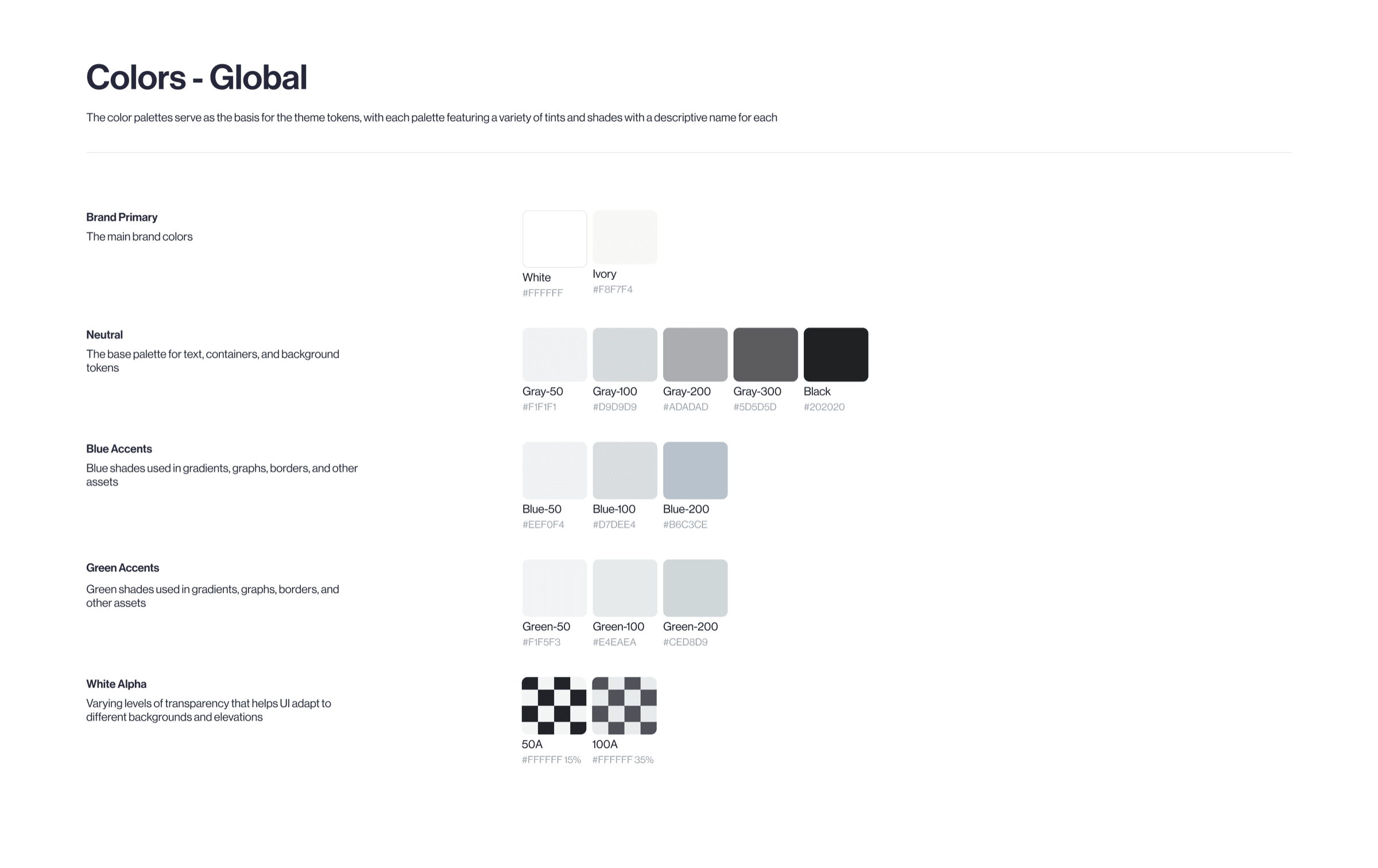
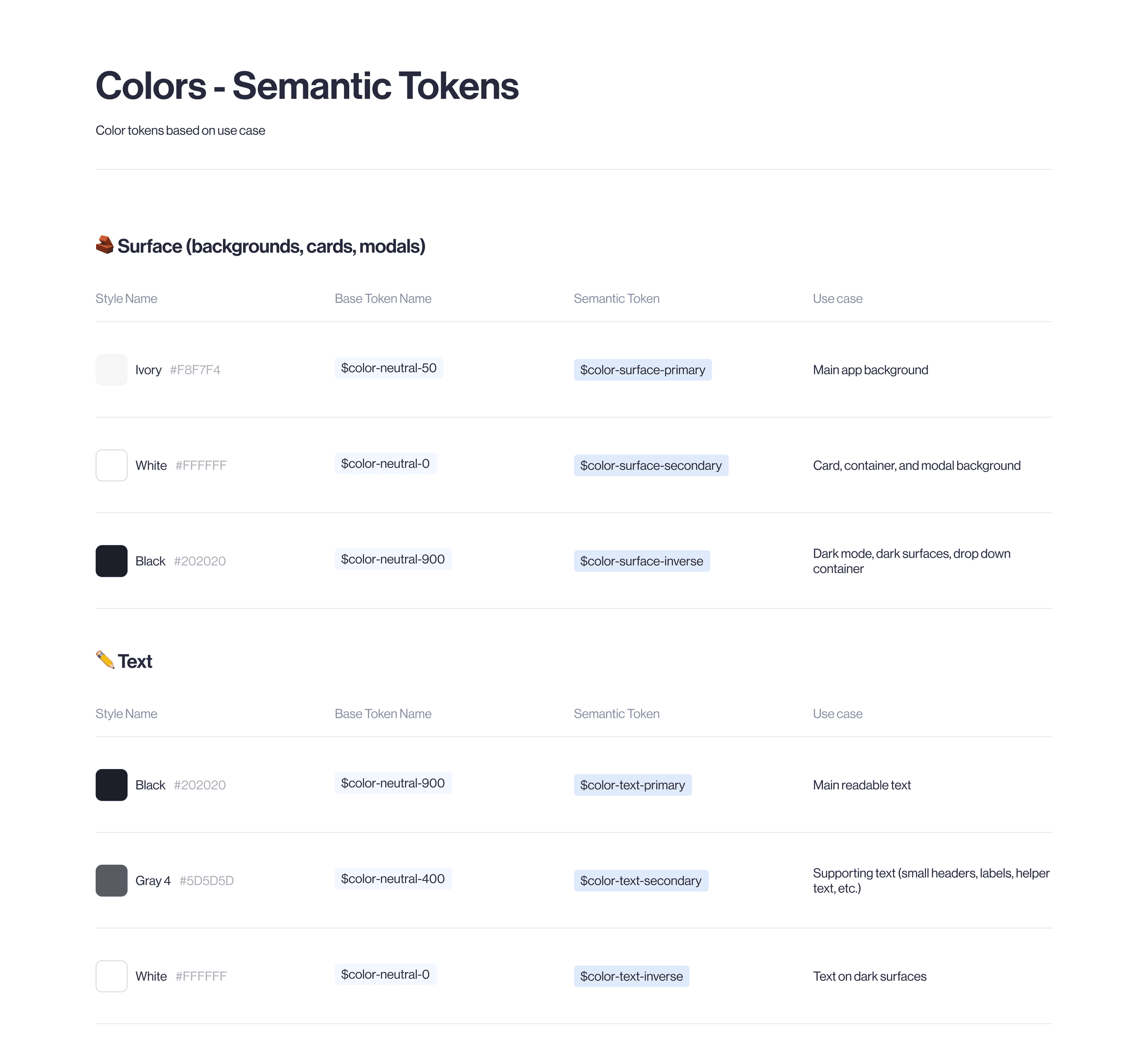
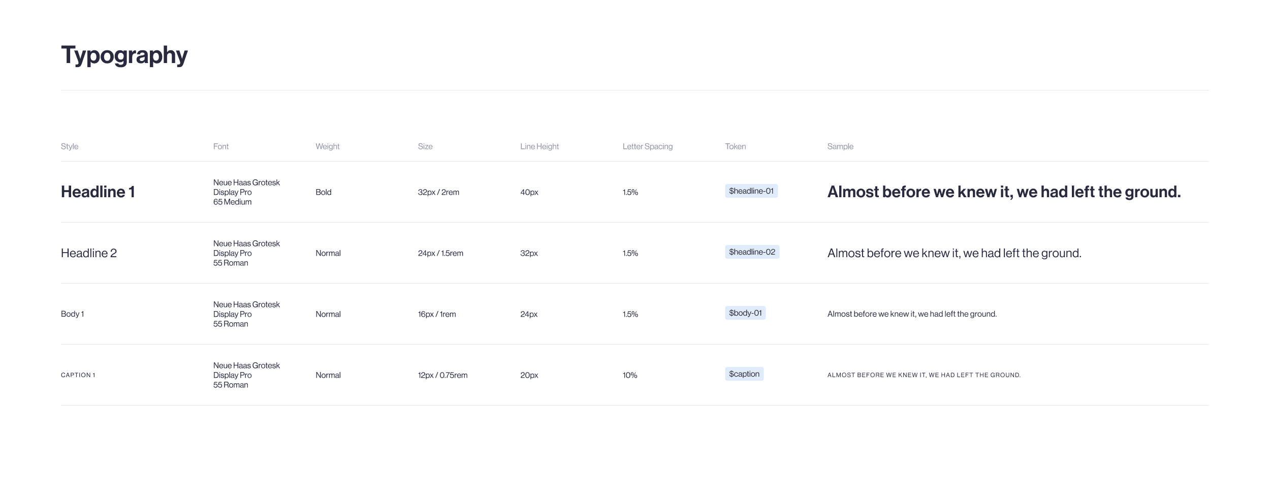
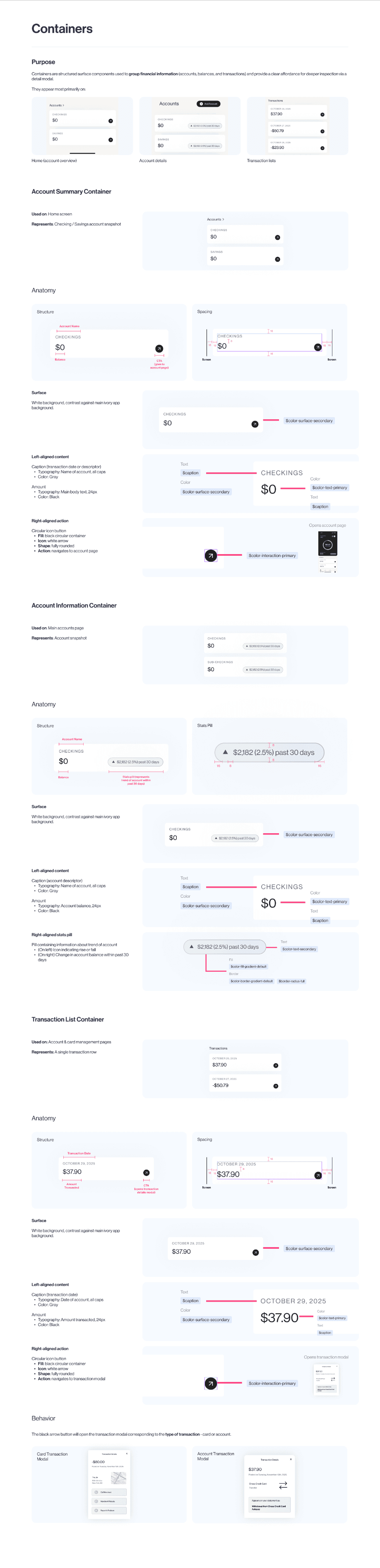
I built the system the app runs on, with tokens for color, type, spacing, and radius, then annotated every component with its anatomy and behavior.
Reflection
The hardest part wasn’t the screens. It was earning trust.
I knew the foundations of fintech, but not deeply, so I put myself through an intense crash course in banking, KYC, and stablecoins before I could design with confidence. The real challenge was designing for people who expect a catch. For them a clear screen isn’t enough: anything that looks hidden reads as the catch.
Next time, test the order of asks sooner
Usability testing came after my contract ended, so the sign-up order rests on research and workshops. Research shows what people say they’d do; only testing shows where they actually drop off. I’d run a few quick tests before handoff, even scrappy ones.
Two questions I handed off
Does asking for the SSN later reduce drop-off? Does seeing yield every day bring people back?
This work is for professional viewing only.
Email me at jesslyn_ruswan@berkeley.edu if you are a hiring manager or recruiter and would like to learn more!